Dexcom Internship
Designing a Siri shortcuts integration for increased accessibility of the mobile app experience.
Project Brief
Research & Discovery
Defining
Development
Prototype
Retrospective

Project Brief

Role
UX Intern
Team
Me
Manager (PM)
UXD Mentor
UXR Mentor
Accessibility Mentor
Timeline
10 weeks, May-July 2024
Tools
Figma
Lucidchart
Miro
Sketch

Who is Dexcom?

Dexcom is a biotech company and the top producer of Continuous Glucose Monitoring (CGM) systems for individuals with diabetes.

The Problem

The Dexcom mobile app pairs with a users' CGM and sends them personal health insights. The app also allows users to track events such as insulin injections, meals eaten, and physical activity.

Based on customer surveys and accessibility audits, the Dexcom mobile app had extremely poor accessibility for those with visual impairments, which makes up approximately 2-5% of the diabetic population.

The Process

To set up a solid backbone for my project, I chose to follow the double-diamon design framework for this project.

Discover
Problem statement, prior research analysis, competitive analysis

Define
Use case ideation, user testing, prioritization mapping, journey mapping

Develop
User Flow diagramming, wireframing, prototyping

Deliver
Demo and final recommendations

Research & Discovery

I conducted both quantitative and qualitative research to gain deeper insight on the problem my app is solving.
The user experience for visual impaired users is cumbersome and slow.
The users must navigate the app through a combination of spoken content and haptic feedback.
-Veronica: Type I diabetic, Fully Blind
“Using my phone is so mentally and physically draining, especially as I age and both my arthritis and cognitive functions worsen.”
Circumstances that warrant voice assistant usage
There are many reasons that Siri can be convenient for all.
Daily phone usage by visually impaired individuals (cataract, legal blindness, glaucoma, diabetic retinopathy, etc.)
While participating in activities such as cleaning, childcare, cooking, etc. where hands are unavailable
For safety-crticial scenarios such as while driving or operating other machinery
Supplementary Research
Dexcom Marketing had conducted prior research on the Siri user experience. I analyzed the data and found that:
1. The current voice assistant experience in Dexcom mobile apps is weak (the only function users could currently perform with Siri was asking for their current blood glucose level)

2. There is
low user awareness of the current in-app voice assistant functionality (<60%)

3. There are certain features within the Dexcom mobile app that cannot be accessed
at all with voiceover (i.e. 24 hour glucose graph)
Competitive Analysis
I looked into other iPhone apps that allow users to set up Siri shortcuts to identify how they approached their set-up and user flow.
FallCall
Emergency Services App
GoodTask
Planner app
Daily Quote
Motivational quotes app
Headspace
Meditation app
Themes Observed from Comp. Analysis
Comparing the positive vs. negative themes I noticed across the applications utilizing Siri shortcuts

Defining

Use Case Ideation
Using the Natural Conversation Framework (NCF) made by IBM and other conversation design principles, I drafted conversation scripts for each use case, including Siri’s standard, partial-error, and unavailable responses.
Syntax Goals
1. Succinct language
2. Precision in diction to avoid confusion
3. An informal, personable tone of voice
4. Correct grammar and organic speaking cadence
Each table was set up in a decision-branch structure, as shown below:
User Testing Phase
Once initial concepting was done, I worked with coworkers to recruit a group of 8 Dexcom users who with a visual impairment.
Interview Setup
User Testing Results
Users were highly satisfied with the overall experience
On a satisfaction scale of 1 to 7, with 7 being the highest, users were satisfied at an average level of 6.432.

Users would use Siri regularly with the Dexcom app

All prompts I explored would be used daily by some users, with the exception of the sensor expiration retrieval prompt.

Users prefer concise language, but with appropriate context
For example, in the meal logging conversation, users preferred Siri to ask “What time?” instead of “For what time should I log your meal?”
User Quotes
"This will help with my hand arthritis since I won't need to be clicking through my phone all day long with assistive touch features"
Veronica
Fully Blind
“I love that Siri read out my entries after logging meals and insulin dosages. This will allow me to confirm that I told Siri the right information.”
Mickey
Fully Blind
“I can’t wait to have this feature in the app, it will save so much time and remove the need to have my husband find info in the app for me”
Patricia
Partially Blind
Prioritization Mapping
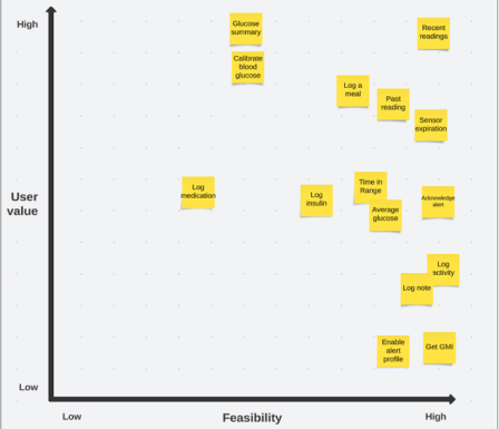
Based off of the results from user interviews, I conducted two card sorting exercises to help me narrow down which Siri prompts were of highest-priority to Dexcom.
Product Needs Summarized
To close out my definition phase, I summarized all of my data and compiled it into a formal Product Needs Document.
The highest-priority Siri shortcuts are glucose summary, recent readings, and meal logging.
Shortcuts must be customizable so that the syntax can match users’ mental heuristic.
Users need to be able to receive the data both visually and audibly to accommodate for user preference.
Users need to be given short, digestible responses to adequately comprehend what they hear. 

Development

User Flow Diagrams
Siri shortcuts are not natively integrated into mobile applications, so users must first decide which Siri shortcuts to activate.

I built user task flow diagrams to pinpoint the “happy path” that users would take while setting up shortcuts for the first time.
Wireframing
I began with a rough draft of paper wireframes, and then transitioned them into low-fidelity wireframes in Figma. I explored 3 different approaches for the shortcut set-up page:

1. Large tile format
2. Empty state with call-to-action button
3. Card format

Prototype

Final Result 1: Siri Setup Page UI
After many iterations of the Siri setup page, I ended up with a final version that organically walks users through the Siri shortcut setup process. I chose the card route from my wireframes, as it allows for high visibility, categorizes by data type, and differentiates active vs. inactive states.
Final Result 2: Siri Command & Response Syntax
I worked with the Instructional & Content Design (ICD) team over several weeks to look closely at each Siri command and accompanying response, and revised the original drafts to produce final versions.
For my final handoff, I submitted a list of the 10 highest-priority Siri shortcuts for the development team to add to their roadmap, along with 7 lower-priority shortcuts.
Conversation Flows
Prioritized:
Glucose Summary
Past Reading
Average Glucose
Time in Range
Acknowledge Alert
Log/ calibrate blood glucose
Log insulin
Log a meal
Sensor expiration
Deprioritized:
Get GMI
Hear audio graph
Activate alert profile
Enable quiet mode
Log medication
Log note

Here is a live demo of a user interacting with Siri for the "Glucose Summary" prompt using Voiceflow, a voice agent prototyping tool:
Final Result 3: Siri Conversation UI

Each Siri response is paired with a visual snippet from the app to convey what task they have just accomplished or what information they’ve just received.
Final Result 4: User Education
To aid discoverability and learnability of the new Siri shortcuts, I designed:
1. A series of in-app tooltip popups that would triggered by specific criteria (such as when a user has had the app for two weeks)
2. An onboarding flow composed of a 3-page lesson that users can click through when they are first introduced to the new Siri features. The lesson contains brief explanations of what Siri shortcuts are and how to interact with it, featuring illustrations and a progress bar to indicate completion. (not shown)
Retrospective
What I learned
1. You never truly know the extent of user pain points until you live in their shoes.

While working on my Siri shortcuts project, I decided to spend a day in the shoes of the user who I would be primarily serving from my project: the visually impaired community. I turned on the VoiceOver feature for my iPhone and navigated the phone that way for the rest of the day, also closing my eyes to fully immerse myself in the experience. Within minutes, I became extremely frustrated by the awkwardness and inconvenience of the whole experience.

2. Always ask for a second opinion.

Several times throughout the project, I found a design roadblock or inconsistency and had to pivot in a new direction. It was a huge help to have multiple eyes on my designs to give me feedback on my ideas. After all, two minds are better than one!
Conclusion
This internship was a massive learning experience which fully plunged me into the world of UXD and UXR at the corporate level. It fully secured my passion for User Experience and confirmed that it is the path I want to continue heading in for my career!
Back to top